MOVEFORWARD AI X CONTRACT

Designing a 0–1 MVP that bridges learning through personalized guidance
I joined Outlearn, an early-stage EdTech startup under (now) MoveForward AI. From 0–1, I owned the design direction, roadmap, and handoffs, helping shape and launch the MVP, a platform that bridges the gap between abundant content and the personalized guidance learners need to turn learning into real growth.
Role
UX Designer
Timeline
Jun- Dec 2021
Team
UX Designer, Senior Designer, Founder, PM
Stakeholders
Moveforward AI exec board
V2
V2
Launched after successful MVP
1,200+
1,200+
Users onboarded post-launch
28%
28%
Rise in onboarding success
Solution Seak Peak!
How might we design a structured and inclusive support system that meets the diverse needs of students, enabling them to navigate the complexities of career decisions seamlessly and make timely, informed choices?
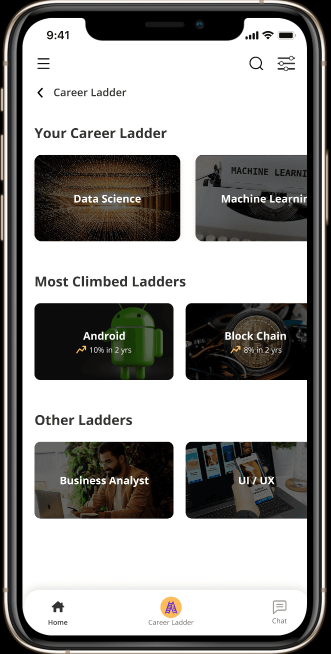
Built for a bigger screen. Mobile version on the way.
The Adaptive Career Ladder
An adaptive Career Ladder that visualizes your current professional stage and dynamically personalizes learning paths, mentorships, and growth opportunities
Career growth means knowing when to pivot, evolve, and align with purpose.
Career growth means knowing when to pivot, evolve, and align with purpose.
The Adaptive Career Ladder
An adaptive Career Ladder that visualizes your current professional stage and dynamically personalizes learning paths, mentorships, and growth opportunities
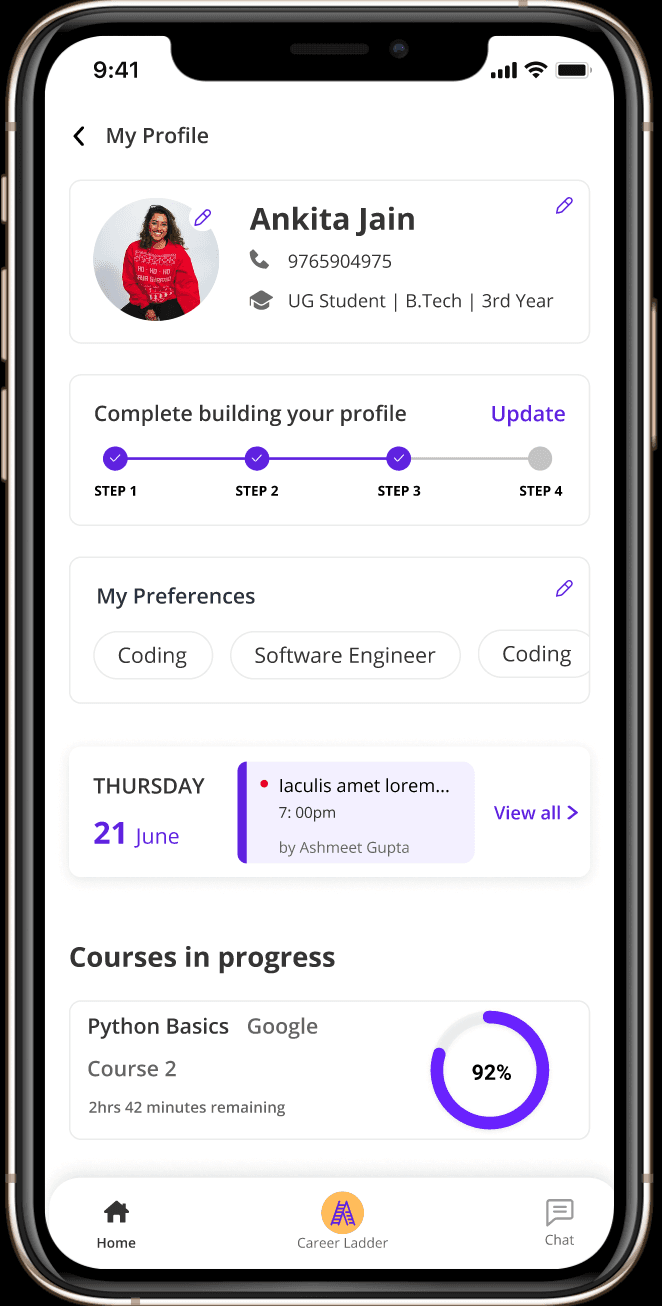
The Personalized Dashboard
The Personalized Dashboard intelligently tracks and visualizes your growth journey, adapting to your evolving goals to keep you informed, motivated, and deeply engaged in your professional development
Individuals stay informed about their progress
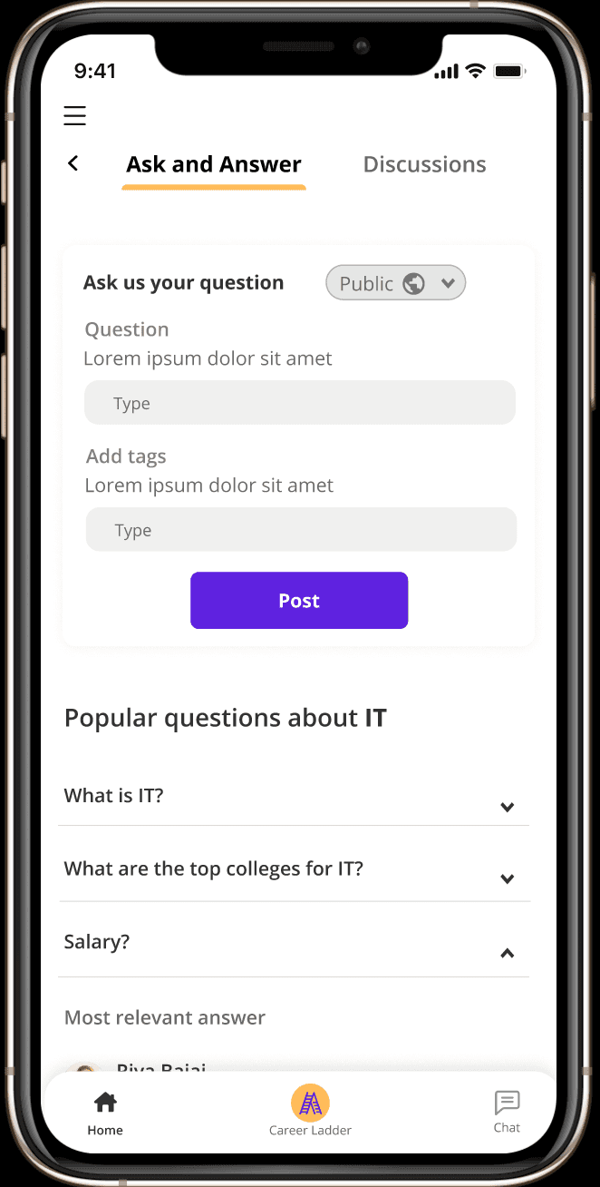
The Accountability Hub
The Community feature connects users with accountability partners and mentors, creating a supportive environment that drives consistency, shared motivation, and meaningful progress toward career goals.
A welcoming forum/environment with peers and mentors
User Research Uncovered...
95% of respondents felt lost without a career guide, revealing a strong need for direction and mentorship.

Students juggle separate tools for academics, careers, and wellbeing with no unified support system
Online advice often lacks reliability, leaving students uncertain about which sources to trust

Endless options overwhelm learners, making it hard to identify the right path forward
Most platforms ignore individual goals and contexts, offering a one-size-fits-all experience
This survey visualizes what young people wish they had more guidance on while navigating major life choices. From college decisions to job openings, the data reveals
College decisions
60%
Job Openings
45%
Examinations
30%
Career path guide
95%
Analyzing data and Design Ideation
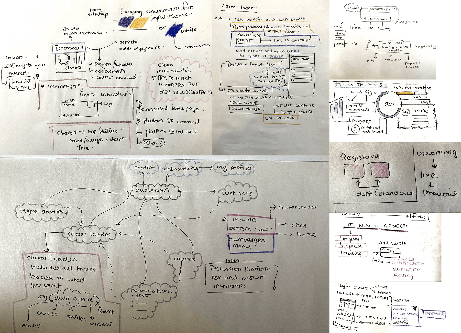
Through card sorting and affinity mapping, I identified that students seek clarity, mentorship, and curated learning resources to build confidence and direction. While early-career professionals aim for growth, peer insight, and industry alignment to make better career decisions.

Creating a journey map, I captured how both college students and early-career professionals begin their career exploration with excitement, but quickly spiral into confusion and pressure as endless options and uncertainty make decision-making overwhelming.

I led brainstorming sessions with the founders and product team, driving idea generation and aligning on key features and product direction
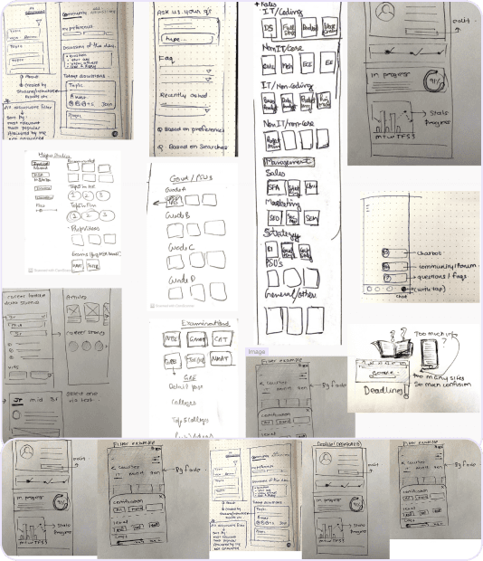
I then rapid wireframes to quickly iterate design concepts, validate user flows, and refine interaction patterns based on early feedback
I designed the site map to organize complex content into a clear, goal-oriented flow. It helped identify navigation gaps early and align team understanding

Analyzing data and Design Ideation
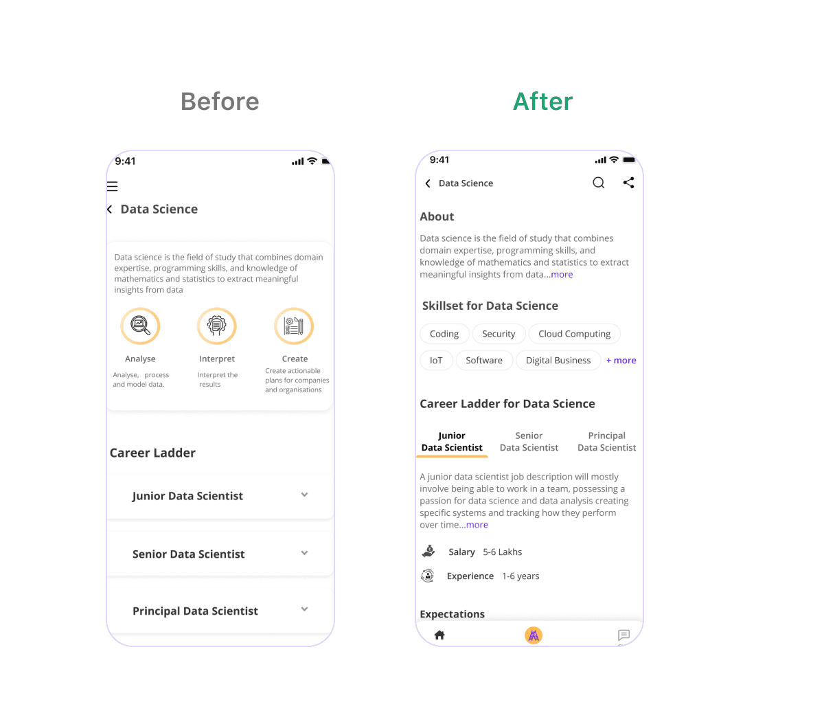
User testing led to a faster, more intuitive experience by replacing slow interactions with guided flows and reorganizing navigation for better clarity, engagement, and feature discoverability.
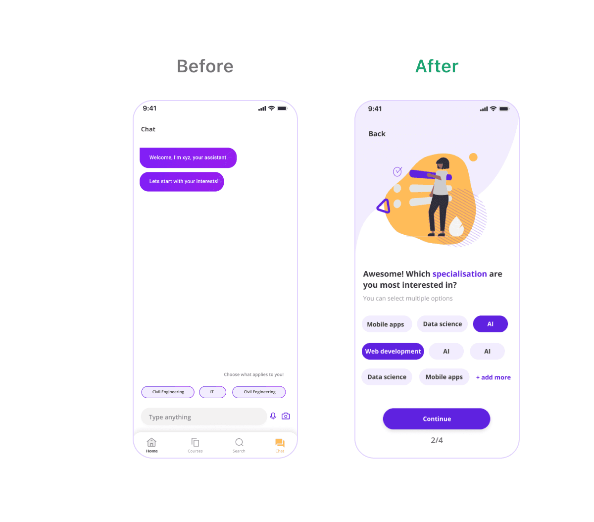
Testing killed the chatbot
Conversation felt like the obvious first step, but testing showed it slowed people down before they reached the product. A guided flow made onboarding quick and engaging instead.
Hiding content behind a tap cost us exploration
Menus hid the content behind a tap and slowed exploration. Putting information upfront in a scrolling list let people browse without deciding what to open first, and engagement went up.
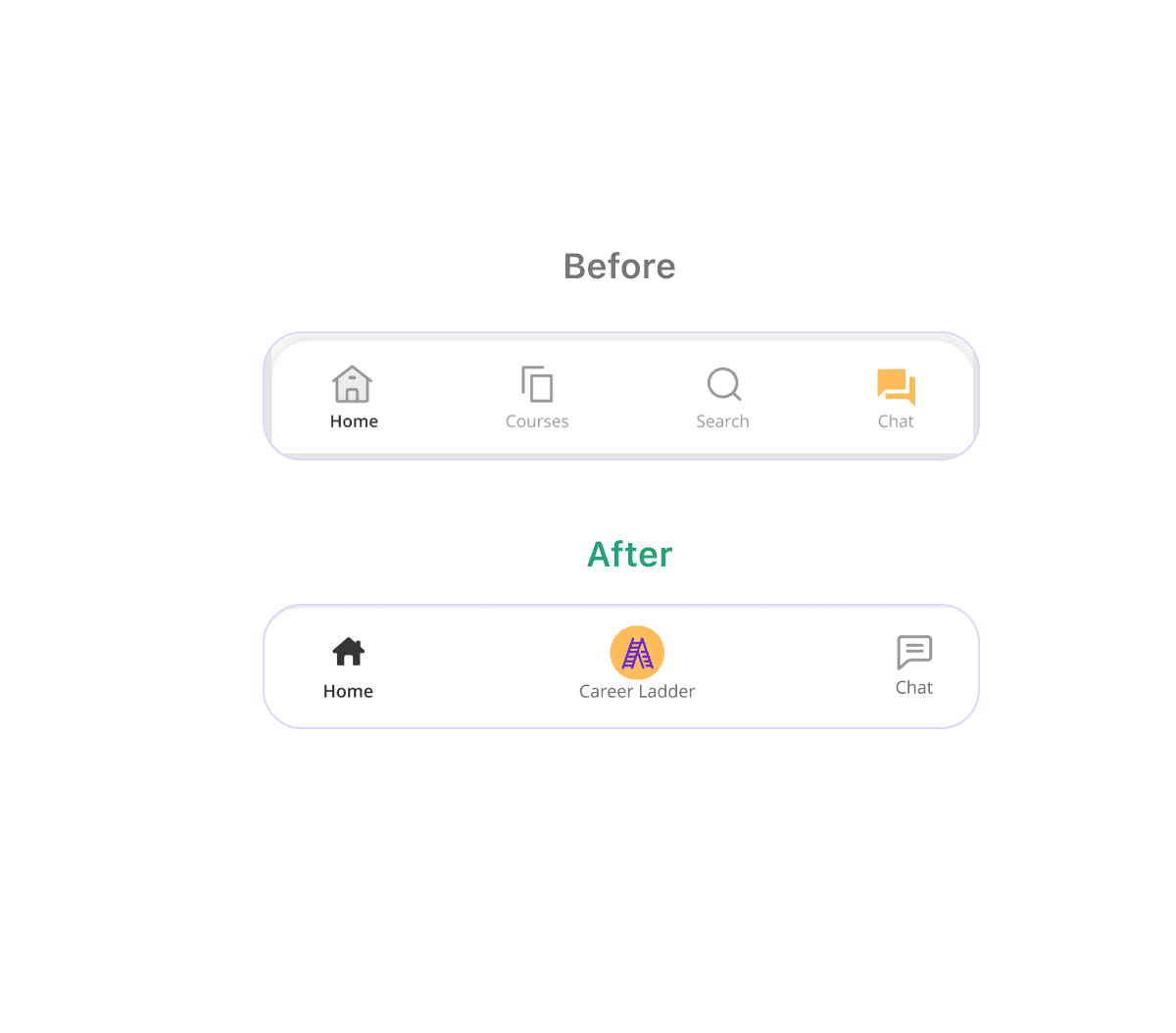
Key features to the bottom bar, everything else behind the menu
Splitting navigation by frequency cleaned up the layout and shortened the path to what people actually reach for. Secondary options moved into the hamburger menu instead of competing for the same space.
The Final Design Snippets
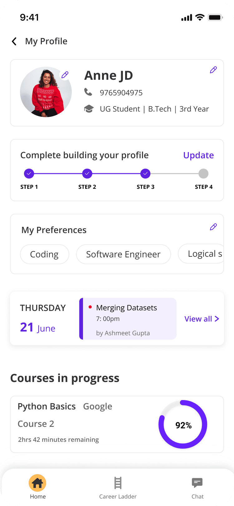
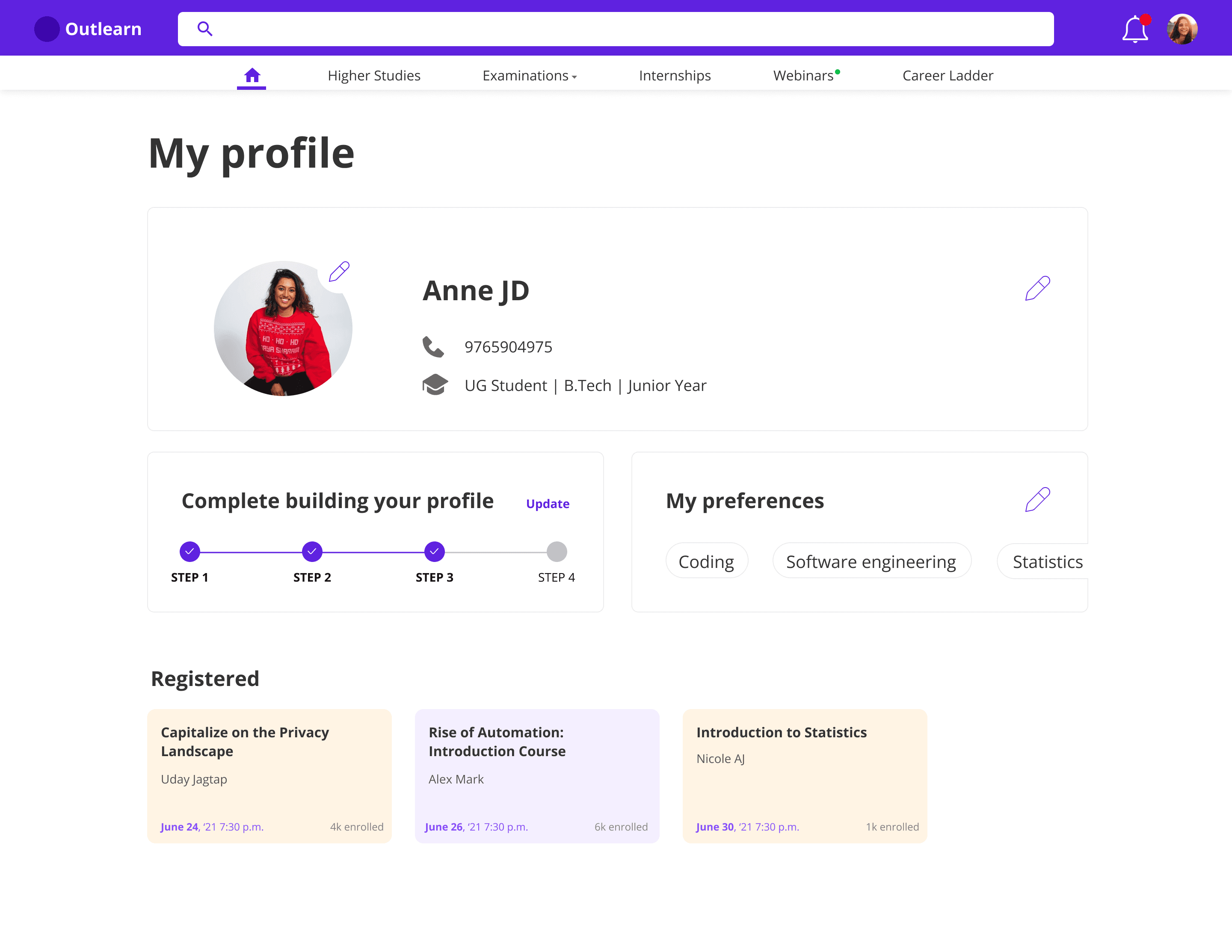
User Profile
New User Onboard
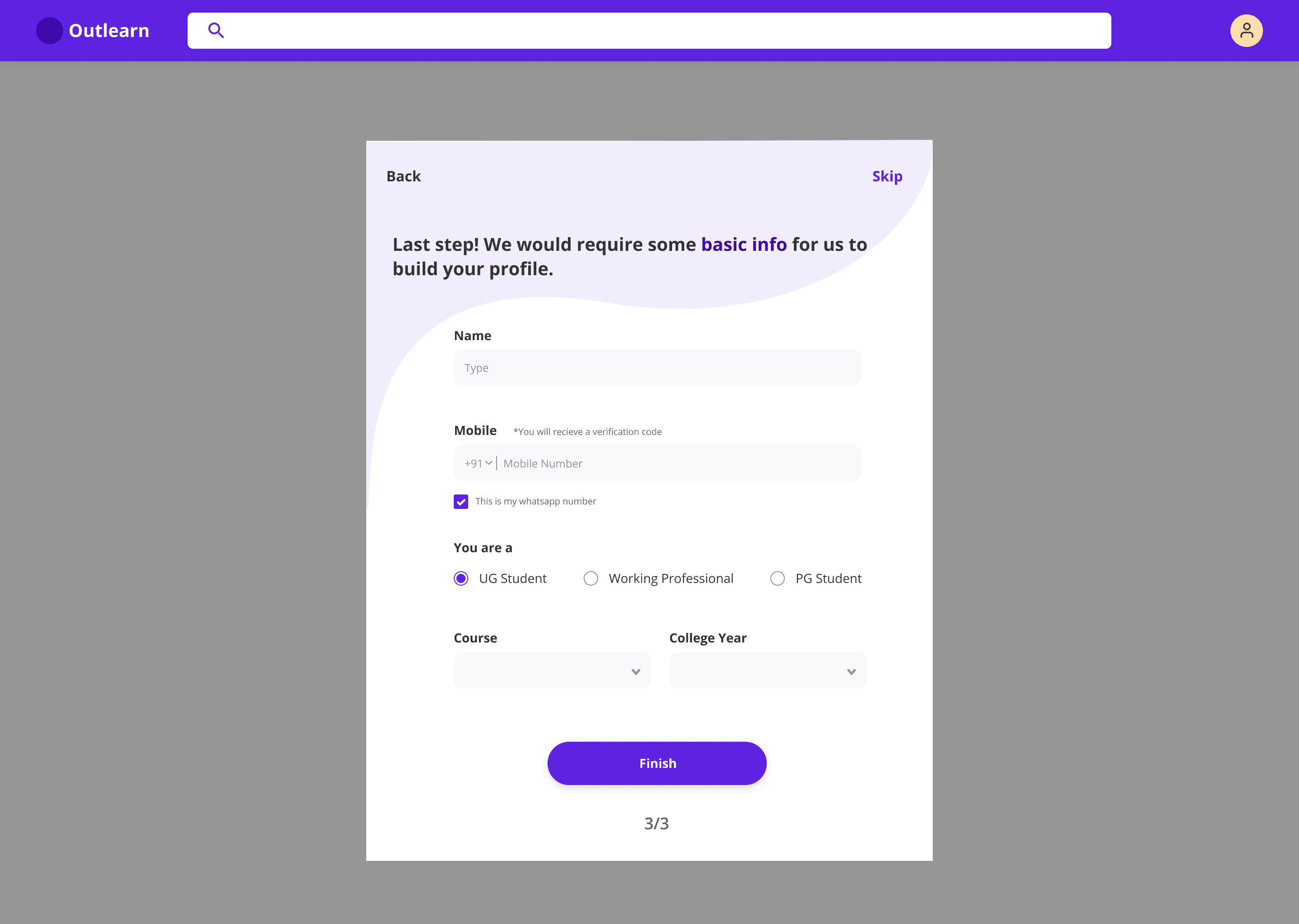
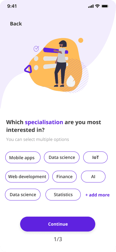
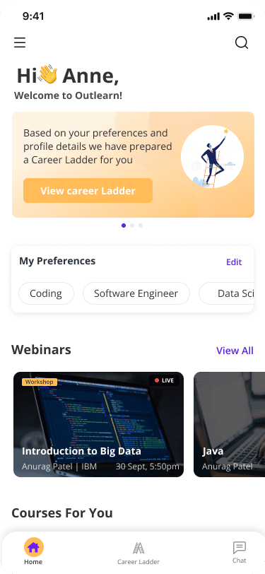
Home
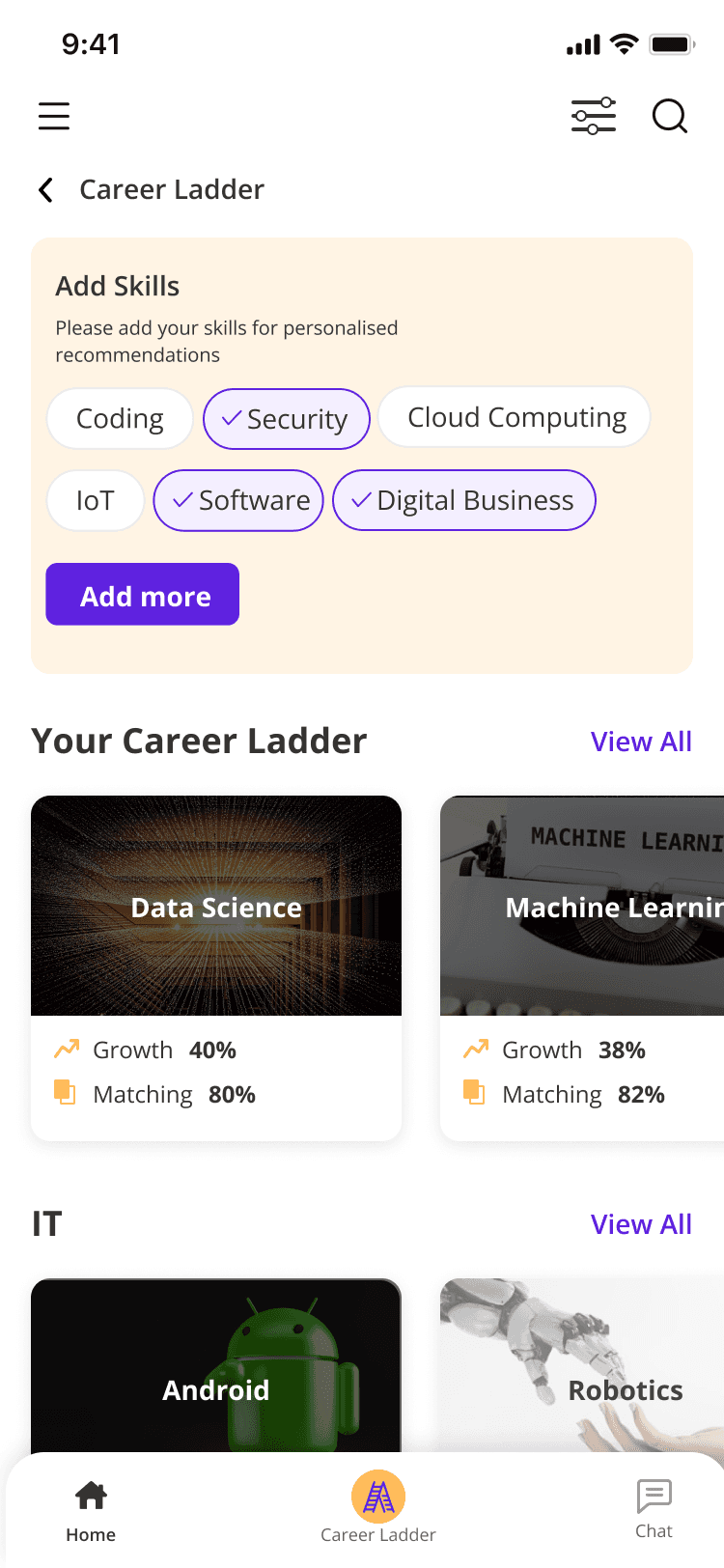
Career Ladder
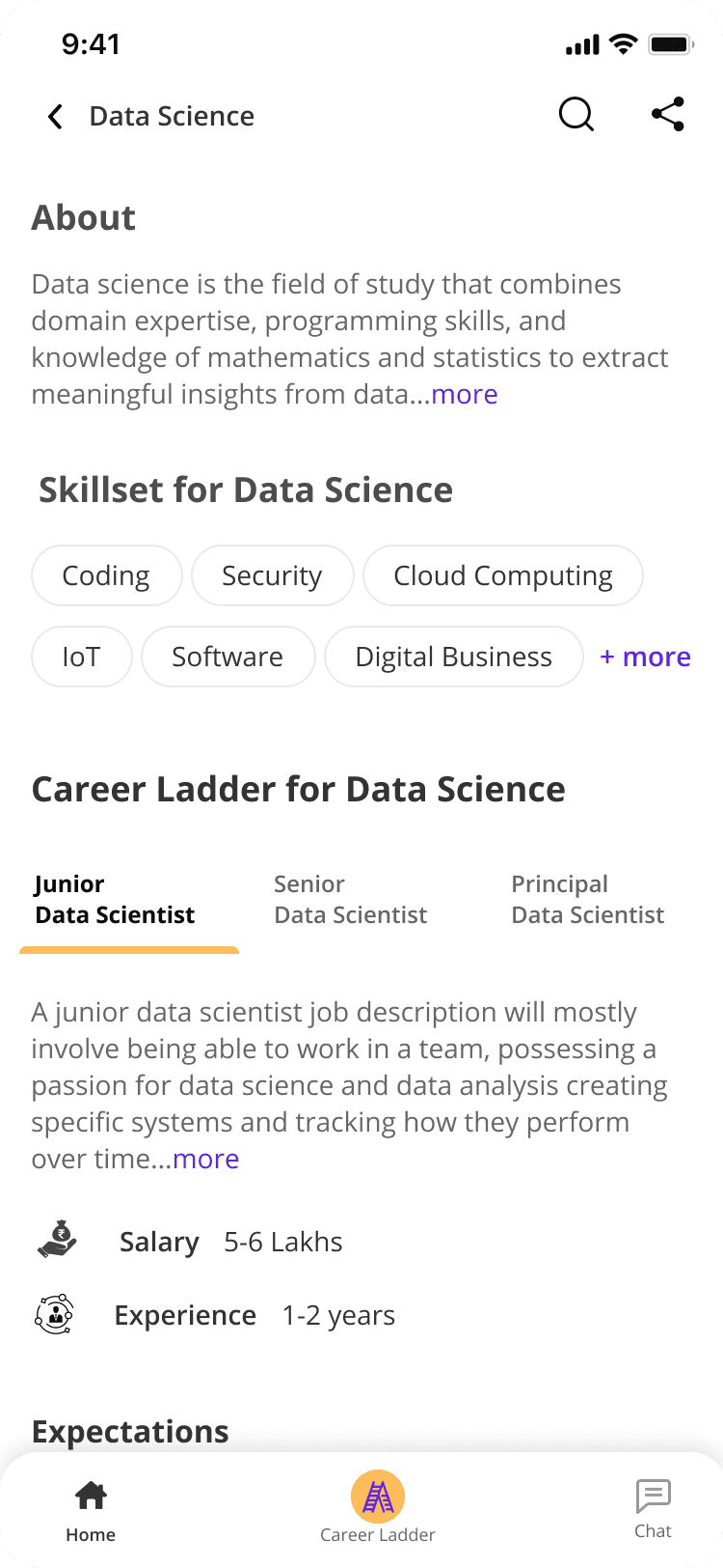
Career Ladder Sub Page
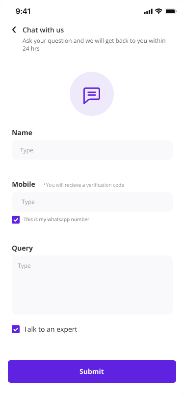
Contact Us
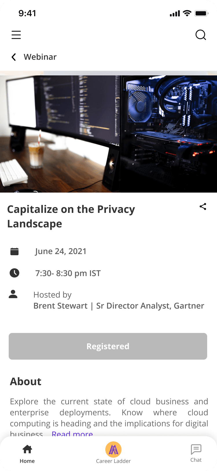
Webinar Sub Page
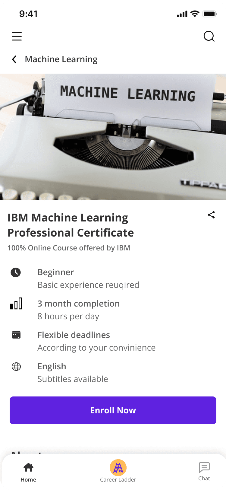
Courses Sub Page
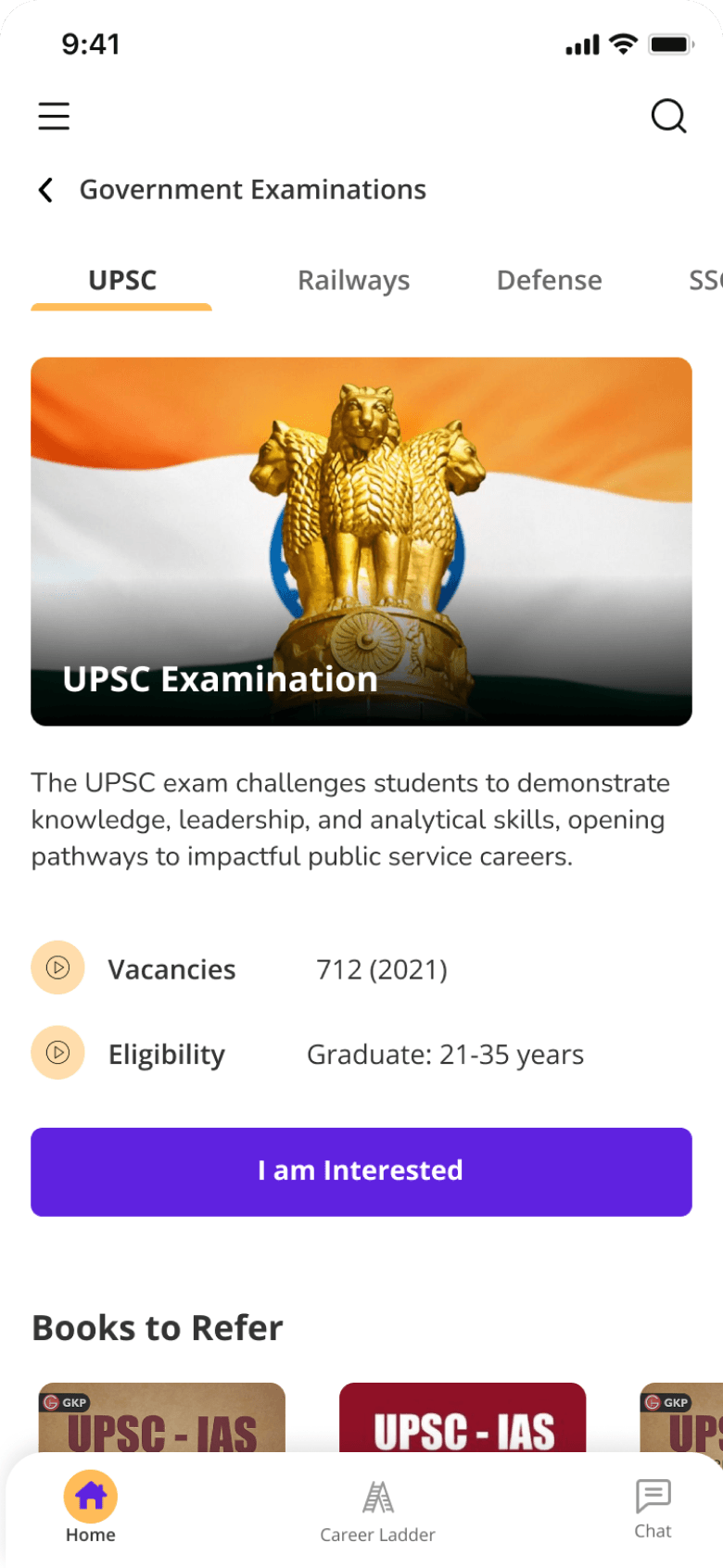
Competitive Exam Sub Page
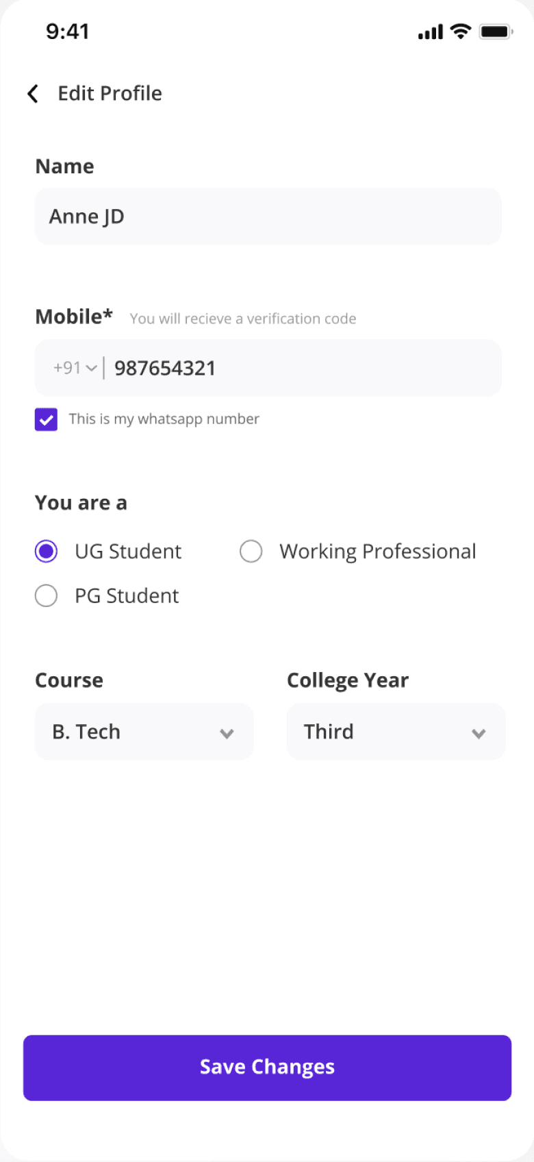
Edit Profile
RETROSPECTIVE
My biggest learning here was aligning design, product, and engineering under 0-1 timelines
Working fast in an early-stage team meant decisions got made with incomplete information, and my job was often to make the tradeoff visible rather than resolve it. What I'd change is the order I did things in: validation came after build more often than it should have.
Test as you build, not only after
Earlier usability testing would have caught assumptions while they were still cheap to change
Define success metrics upfront
Without them agreed at the start, impact gets argued rather than measured
Speed is a design constraint
Tight timelines meant deciding what "good enough to ship" meant, and saying so out loud
Designed and built with purpose | © 2026 Divya Mavinkurve. All rights reserved.
Designed and built with purpose | © 2026 Divya Mavinkurve. All rights reserved.
Designed and built with purpose | © 2026 Divya Mavinkurve. All rights reserved.
Designed and built with purpose
© 2025 by Divya Mavinkurve