Timeline
Team
Deliverables
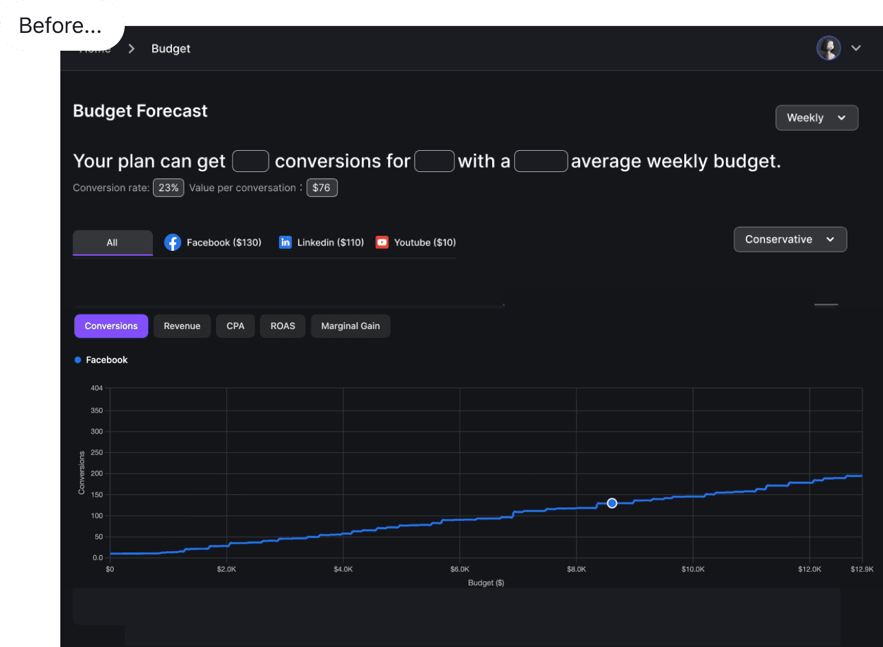

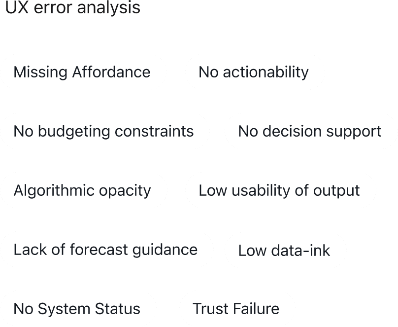
OPPORTUNITY
AdsGency needed forecasting to drive decisions, not just display data. Only 4% active use among total paid plan users
Our goal wasn't to show numbers. It was to give marketing teams enough confidence to commit budget inside the product, and guide users with next steps. Without that, the tool had no real value in the planning workflow.
Users
Core jobs to be done
USER FLOW
What if your forecasting tool didn't just show you what was coming- but told you what to do about it? That's the shift I designed, and I worked with Claude.ai to poke holes in the logic before a single line of code was written.

SOLUTION
Predictive clarity from first input to final commit, build with figma's MCP and Claude Code
FLOW 1
Focused budget input with system status visibility interaction
Our goal wasn't to show numbers. It was to give marketing teams enough confidence to commit budget inside the product, and guide users with next steps. This feature surfaces just enough of what goes into defining the budget, giving users visibility into the system without overwhelming them, so they can understand the logic, build trust, and feel confident committing spend within the product.
FLOW 2
Progressive disclosure through categorized insight cards
In conversations with the team, we aligned on one thing — the output needed structure. Not everything the AI surfaces carries the same weight, so we prioritized separating insights by category. I took that decision into the design, translating it into categorized cards that give each insight type its own space.

I took that decision into the design, translating it into categorized cards that give each insight type its own space.

FLOW 3
People wouldn't commit budget to a tool that could overwrite it
Budget locking freezes an approved baseline while everything unlocked stays explorable, so AI can re-optimize the rest without touching what you've committed. I built it from existing chart components, carrying the channel colors through.
FLOW 4
Skeleton screen and error states
Users used to land on a blank screen with no sense of what came next. I designed a skeleton state that previews the structure before data loads, so people know what they're about to interact with. And if the tool errors out, you pick up where you left off with nothing lost.
FLOW 5
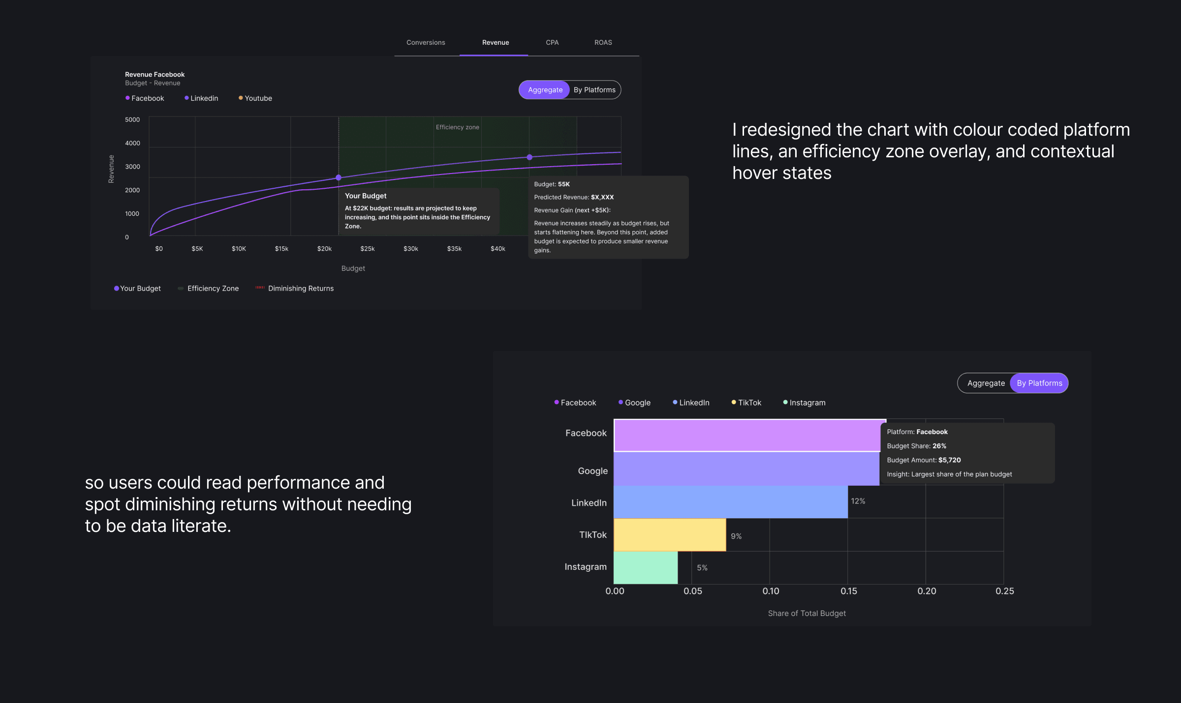
Redesigning analytics charts for clearer multi-variable readability
Based on backend capacity, we designed the forecasting charts such that users can scenario-plan, drag to test budgets, see the per-platform breakdown, and get an AI nudge on where to shift spend
TESTING AND ITERATION
Testing and iteration cycles through prototyping and prompting, with human eye for design detail
Early passes surfaced two fixes. The design system purple was barely clearing contrast standards, so I built a Claude skill to run contrast checks and swapped in a compliant color and made standardized changes across every feature and back into the design system.

IMPACT

RETROSPECTIVE
Working on developer AI tools made me a sharper prompter, and that carries straight into how I design
Claude and Cursor let me wireframe fast, pressure-test flows, and generate prototype code for handoff. Speed isn't really the point. The work stays grounded in user needs, and that clarity is what makes it fast.
Designed and built with purpose | © 2026 Divya Mavinkurve. All rights reserved.